Once a week, we will share the information visualisations of the week and discuss them.
First up this week, Birgit discusses a poster made by Eemeli Nieminen, a graphic designer from Finland.
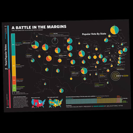
Source: Eemeli Nieminen
The data used were all votes from the US 2008 elections that were not cast on Obama or McCain. Every state has a pie chart that represents the division of these remaining votes. The size of the pie chart represents the share of the total number of votes cast in that state. The scale can be seen on the right of the map. Below the map is also a visualisation of the hypothetical electoral college.
A ‘lesson learned’ indicated by the designer himself is that on his visualisation, the percentages are linked to the diameter of the pie chart (as you can see on the scale), so an increase of one percent results in the doubling of the diameter. This causes differences to seem much larger than they actually are, or for some states, the pie charts to be nearly invisible.
Furthermore, there are several sources ([1],[2],[3]) that state that people in general are not very good at comparing angles and surfaces. This makes it hard to properly compare different areas in a pie chart. For charts with 2 or three elements, it is still somewhat possible – although the perception will still not be accurate – but from the moment there are four or more, it becomes nearly impossible.
So, even though it looks good from a design point of view, it is actually not a very good visualistion.
In this second part Glenn discusses the redesign of the subway map of Paris made by Max Roberts, teacher Psychology at the university of Essex.

Most maps nowadays map routes of public services on the real grid plan of the city. Although they are veracious, they tend to be inefficient. This raised the question, how to make them more efficient. According to Max Roberts it should be possible to get the most efficient route in one blink of an eye.
The production of this design wasn’t easy: Paris has one of the most extensive and confusing subway networks around the world. So before Robert started on his design he studied the archives of the RATP ( public services company of the french capital Paris) and the design of the la Goutte d’Or district.
After his thorough study of the zigzag patrones on those versions he decided to give the chart a cyclic structure. Getting rid of unneccesary stops and short cuts made it so that travelers could quickly pick the most efficient route, maybe not the shortest, but definitely the fastest.
According to Roberts, a subway map shouldn’t follow the grid of the city. The purpose of those maps isn’t to represent the distance between stops in an accurate way, but to visualise to connectivity between stops in an efficient way so travelers could pick the best option for them eventhough this means in reality travelling more kilometers. The results were that travelers would cut there travelling time in half. [4]
So it seems that when it comes to visualising information it is not always neccesary to represent it in a realistic way, but often even better to do it in an abstract way so we don’t get distracted by unneccasairy details and things that do not matter. This way the information is less cluttered with all kinds of stuff and most of the time more efficient in showing the relevant information. This vision is based on one of the principles of abstraction which is only show what is relevant at the given level of abstraction so things stay comprehensible and clear. [5]
I only have one minor issue with this representation and that is when your travelling throughout the city and you don’t know which station you need to take to get to your destination, this plan will be of no use. So if you want to use this plan, you should have an idea of the city layout and therefor be combining a city map and a subway map to get to your destination which is what nowadays subway maps do. This does not apply to regular subway users since they either know which stations to take or the city layout.
So for the sole purpose of representing the information of the connectivity of the subway stations it is good. However when occasional travellers are using it they also need a city map, be it an mental representation or a real map, so a combination of those two should always be present when planning a route. So it’s good to keep an eye on the application when visualising information.
In this third part Carmen looks at a graph present in a previous course of hers (Integral quality management).
 [6]
[6]
The graph shows the progress of costs and cash flow from the moment of conceptualization of the product over the entire life span. It is a theoretical visualization, it does not rely on actual data but upon some theoretical compounds of integral quality management.
The graph was present in the course book which was printed completely black and white. This was also the only place the graph was presented towards the students. As can be seen from the picture, there is a clear mismatch in design and presentation of the graph. The graph was designed with a color legend but is presented in a black and white book. The legend becomes futile and the students is left to guess or research which line respresents what.
This case clearly showes that it is very important to always think about the form in which your infographic will be presented. This problem could have been easily prevented by using full/dotted lines.
Sources
[1] Stephen Few (August 2007). Save the pies for dessert. Perceptual Edge, Visual Business Intelligence Newsletter.
[2] Cole Nussbaumer Knaflic (July 2011). Death to pie charts.
[3] Walter Hickey (June 2013). The worst chart in the world.
[4] Het Laatste Nieuws (December 2015), Nieuw Vereenvoudigd metroplan van Parijs maakt het leven simpeler.
[5] Wikipedia (February 2016), Abstraction.
[6] Demeulemeester, E., 2008, Integrale Verplicht Kwaliteitsbeheersing kwaliteitsbeheersing, Alta Uitgeverij.

Regarding the first visualisation, I guess Joris hasn’t done his rant about piecharts yet 😉
(I suggest you ask him today)
LikeLike
Actually, he has in a previous class – I support his vision, as I explain in my discussion of it 🙂
LikeLike